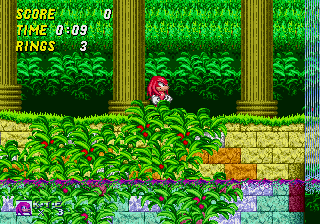
The solution is to include a replacement art file within the Knuckles in Sonic 2 patch ROM. Interestingly, the developers chose to make the replacement barrier grey; possibly a red barrier looked too dark.

The patch ROM also includes replacement art for the invincibility stars, as well as item box icons for either power-up:


So why is the green color in the middle of the gradient? My first guess was so that it lines up with the color used for the title card backgrounds, but it turns out that's wrong: without any modification, title cards would use a different color:


Instead, what I found was that the game uses animal graphics from the Sonic 2 cartridge, and the green color seems to have been purposely lined up so it causes minimal disturbance to the Flicky sprite:


Flickies aren't the only sprites without replacement art. As I showed off last time, the water sprites in Aquatic Ruin Zone are rendered using Sonic's blues in Sonic 2, translating into a red and green mess once Knuckles' palette is applied:


However, this was already a problem in Sonic 2, because the blue colors in the player palette aren't safe to use. When Sonic turns into Super Sonic, anything using those colors will also start glowing bright yellow:

Finally, let's look at the lives icon. This one is interesting because everything was remapped to the player palette, even the text which normally uses the ring colors on the enemy palette:


Note how the text also retains the white shine characteristic of Sonic 3's HUD. This leads me to believe that the palette conversions were all done by a programmer, without using graphics editing tools. Note additionally how Knuckles' head in Sonic 2 has a rougher appearance; yet another glimpse into the Knuckles of days past.

2 comments:
That HUD icon also is different from the leftover in the Sonic 3 ROM (which is the same as the one in S&K).
Strange...
It would seem to indicate that the Knuckles in Sonic 2 project branched off before the Sonic 3 ROM was finalized.
Post a Comment